Misc
Mercator Misconceptions: Clever Map Shows the True Size of Countries

This Clever Map Shows the True Size of Countries
Maps are hugely important tools in our everyday life, whether it’s guiding our journeys from point A to B, or shaping our big picture perceptions about geopolitics and the environment.
For many people, the Earth as they know it is heavily informed by the Mercator projection—a tool used for nautical navigation that eventually became the world’s most widely recognized map.
Mercator’s Rise to the Top
With any map projection style, the big challenge lies in depicting a spherical object as a 2D graphic. There are various trade-offs with any map style, and those trade-offs can vary depending on how the map is meant to be used.
In 1569, the great cartographer, Gerardus Mercator, created a revolutionary new map based on a cylindrical projection. The new map was well-suited to nautical navigation since every line on the sphere is a constant course, or loxodrome.
Geographic Inflation
The vast majority of us aren’t using paper maps to chart our course across the ocean anymore, so critics of the Mercator projection argue that the continued use of this style of map gives users a warped sense of the true size of countries—particularly in the case of the African continent.
Mercator’s map inadvertently also pumps up the sizes of Europe and North America. Visually speaking, Canada and Russia appear to take up approximately 25% of the Earth’s surface, when in reality they occupy a mere 5%.
As the animated GIF below—created by Reddit user, neilrkaye – demonstrates, northern nations such as Canada and Russia have been artificially “pumped up” in the minds of many people around the world.
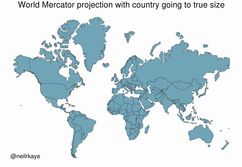
Greenland, which appears as a massive icy landmass in Mercator projection, shrinks way down. The continent of Africa takes a much more prominent position in this new, correctly-scaled map.
This visualization also highlights how distorted neighboring countries can look in Mercator projection. In the GIF above, Scandinavian countries no longer loom imposingly over their European neighbors, and Canada deflates to a size similar to the United States.
Despite inaccurate visual features—or perhaps because of them—the Mercator projection has achieved widespread adoption around the world. This includes in the classroom, where young minds are first learning about geography and forming opinions on the relationships between countries.
Getting Reacquainted with Globes
Google, whose map app is used by approximately 150 million people per month, took the bold step of using different projections for different purposes in 2018.
The Earth is depicted as a globe at further zoom levels, sidestepping map projection issues completely and displaying the world as it actually is: round. The result is a more accurate depiction of countries and landmasses.
With 3D Globe Mode on Google Maps desktop, Greenland's projection is no longer the size of Africa.
Just zoom all the way out at https://t.co/mIZTya01K3 😎🌍 pic.twitter.com/CIkkS7It8d
— Google Maps (@googlemaps) August 2, 2018
At closer zoom levels, users are typically using maps for things like navigation, which the Mercator projection was designed for. The exact angles of roads and borders are preserved in this projection.
In the Right Direction
In a more globally connected world, geographic literacy is more important than ever. As people become more accustomed to equal area maps and seeing the Earth in its spherical form, misconceptions about the size of continents may become a thing of the past.
This post was first published in 2018. We have since updated it, adding in new content for 2021.


Misc
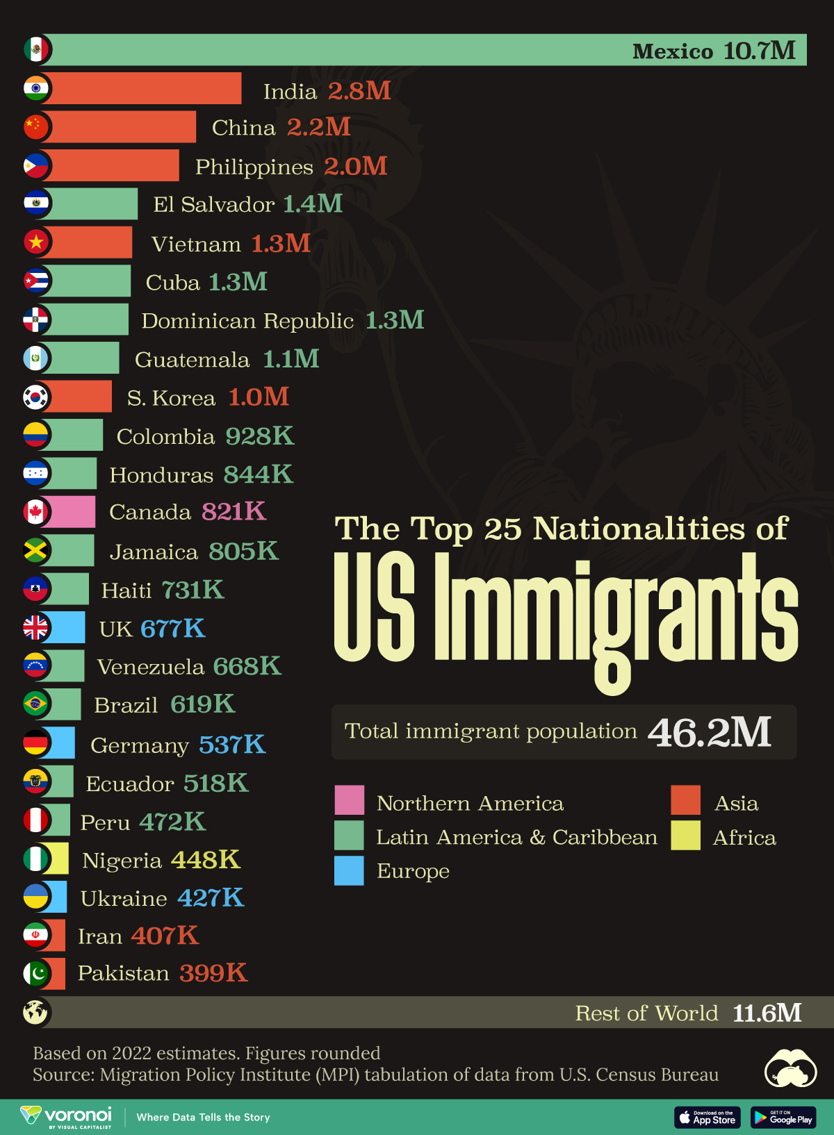
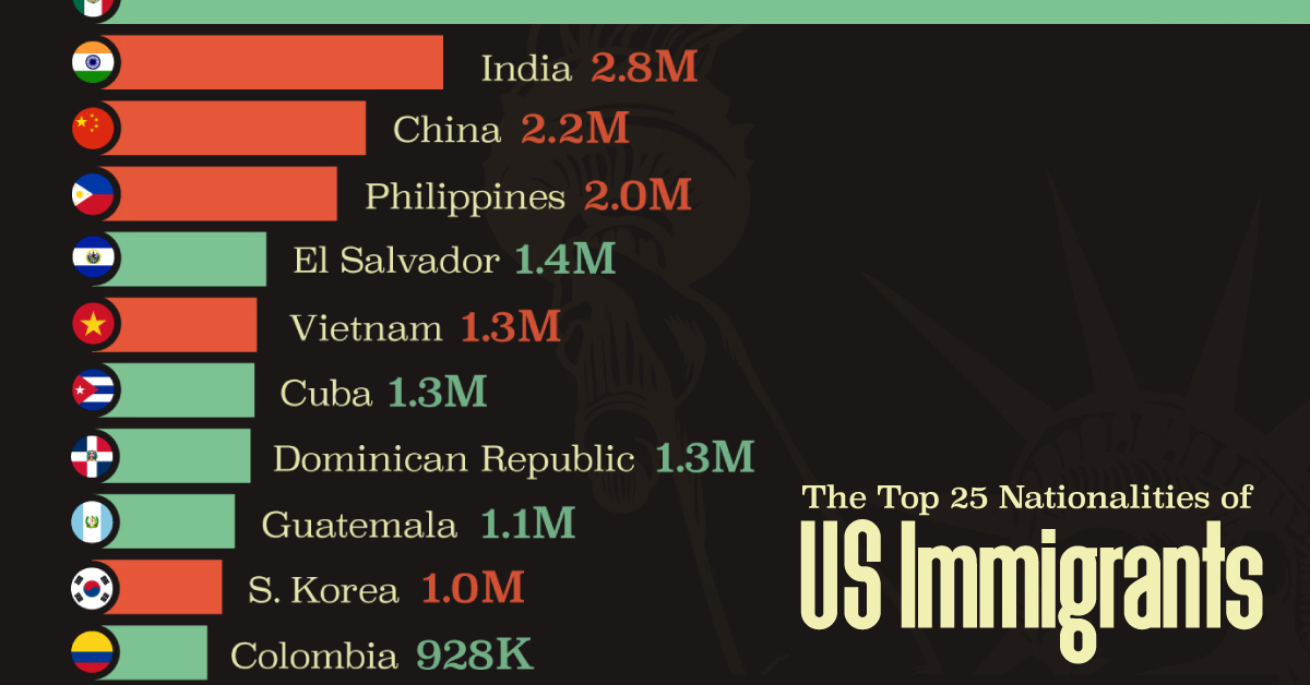
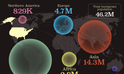
The Top 25 Nationalities of U.S. Immigrants
Mexico is the largest source of immigrants to the U.S., with almost 11 million immigrants.
The Top 25 Nationalities of U.S. Immigrants
This was originally posted on our Voronoi app. Download the app for free on iOS or Android and discover incredible data-driven charts from a variety of trusted sources.
The United States is home to more than 46 million immigrants, constituting approximately 14% of its total population.
This graphic displays the top 25 countries of origin for U.S. immigrants, based on 2022 estimates. The data is sourced from the Migration Policy Institute (MPI), which analyzed information from the U.S. Census Bureau’s 2022 American Community Survey.
In this context, “immigrants” refer to individuals residing in the United States who were not U.S. citizens at birth.
Mexico Emerges as a Leading Source of Immigration
Mexico stands out as the largest contributor to U.S. immigration due to its geographical proximity and historical ties.
Various economic factors, including wage disparities and employment opportunities, motivate many Mexicans to seek better prospects north of the border.
| Country | Region | # of Immigrants |
|---|---|---|
| 🇲🇽 Mexico | Latin America & Caribbean | 10,678,502 |
| 🇮🇳 India | Asia | 2,839,618 |
| 🇨🇳 China | Asia | 2,217,894 |
| 🇵🇭 Philippines | Asia | 1,982,333 |
| 🇸🇻 El Salvador | Latin America & Caribbean | 1,407,622 |
| 🇻🇳 Vietnam | Asia | 1,331,192 |
| 🇨🇺 Cuba | Latin America & Caribbean | 1,312,510 |
| 🇩🇴 Dominican Republic | Latin America & Caribbean | 1,279,900 |
| 🇬🇹 Guatemala | Latin America & Caribbean | 1,148,543 |
| 🇰🇷 Korea | Asia | 1,045,100 |
| 🇨🇴 Colombia | Latin America & Caribbean | 928,053 |
| 🇭🇳 Honduras | Latin America & Caribbean | 843,774 |
| 🇨🇦 Canada | Northern America | 821,322 |
| 🇯🇲 Jamaica | Latin America & Caribbean | 804,775 |
| 🇭🇹 Haiti | Latin America & Caribbean | 730,780 |
| 🇬🇧 United Kingdom | Europe | 676,652 |
| 🇻🇪 Venezuela | Latin America & Caribbean | 667,664 |
| 🇧🇷 Brazil | Latin America & Caribbean | 618,525 |
| 🇩🇪 Germany | Europe | 537,484 |
| 🇪🇨 Ecuador | Latin America & Caribbean | 518,287 |
| 🇵🇪 Peru | Latin America & Caribbean | 471,988 |
| 🇳🇬 Nigeria | Africa | 448,405 |
| 🇺🇦 Ukraine | Europe | 427,163 |
| 🇮🇷 Iran | Middle East | 407,283 |
| 🇵🇰 Pakistan | Asia | 399,086 |
| Rest of World | 11,637,634 | |
| Total | 46,182,089 |
Mexicans are followed in this ranking by Indians, Chinese, and Filipinos, though most immigrants on this list come from countries in the Latin American and Caribbean region.
On the other hand, only three European countries are among the top sources of U.S. immigrants: the UK, Germany, and Ukraine.
Immigration continues to be a significant factor contributing to the overall growth of the U.S. population. Overall population growth has decelerated over the past decade primarily due to declining birth rates.
Between 2021 and 2022, the increase in the immigrant population accounted for 65% of the total population growth in the U.S., representing 912,000 individuals out of nearly 1.4 million.
If you enjoyed this post, be sure to check out Visualized: Why Do People Immigrate to the U.S.? This visualization shows the different reasons cited by new arrivals to America in 2021.

-

 Personal Finance1 week ago
Visualizing the Tax Burden of Every U.S. State
-

 Misc6 days ago
Visualized: Aircraft Carriers by Country
-

 Culture6 days ago
How Popular Snack Brand Logos Have Changed
-
 Mining1 week ago
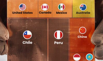
Visualizing Copper Production by Country in 2023
-

 Misc1 week ago
Charted: How Americans Feel About Federal Government Agencies
-
 Healthcare1 week ago
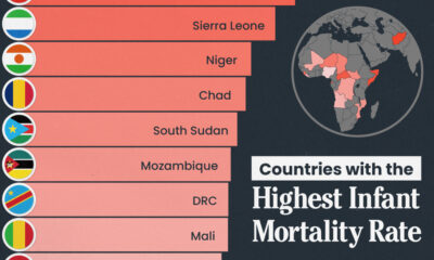
Which Countries Have the Highest Infant Mortality Rates?
-
 Demographics1 week ago
Mapped: U.S. Immigrants by Region
-
 Maps1 week ago
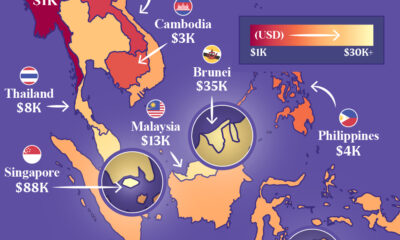
Mapped: Southeast Asia’s GDP Per Capita, by Country