How Susan Kare Designed User-Friendly Icons for the First Macintosh
The graphic designer is receiving a Lifetime Achievement Award from Cooper Hewitt for her recognizable computer icons, typefaces and graphics
/https://tf-cmsv2-smithsonianmag-media.s3.amazonaws.com/accounts/headshot/dave.png)
/https://tf-cmsv2-smithsonianmag-media.s3.amazonaws.com/filer/1a/ff/1aff6159-3eb3-4a66-8eeb-e95bdc7f46b3/susankare.jpg)
If it wasn’t for needlepoint, the computer graphics we have come to know and love today might have looked a lot different. Pioneering designer Susan Kare was taught by her mother how to do counted-thread embroidery, which gave her the basic knowledge she needed to create the first icons for the Apple Macintosh 35 years ago.
“It just so happened that I had small black and white grids to work with,” she says. “The process reminded me of working needlepoint, knitting patterns or mosaics. I was lucky to have had a mother who enjoyed crafts.”
Kare’s breakthrough designs for the Macintosh, which included the smiling computer at startup, trash can for recycling and a computer disk for saving files, are now commonplace in the digital era. They are so recognizable that they are legendary.
Her icons and graphics—many of which were patented through the U.S. Patent and Trademark Office—for Apple, Facebook, IBM, Microsoft and other clients have earned her the Lifetime Achievement Award from the Cooper Hewitt, Smithsonian Design Museum. She receives the honor October 17 at the 20th Annual National Design Awards in the Arthur Ross Terrace and Garden at the museum.
Known today as “the woman who gave the Macintosh a smile,” Kare had little experience with computers when she first went to work for Apple in 1983. She was a young sculptor when she received a call from an old friend asking if she would be interested in applying for a job creating graphics and typefaces for the new personal computer Apple was planning to release in 1984.
Kare had never designed a typeface before, but she didn’t let her unfamiliarity stop her. She quickly learned what she needed to know and set about creating the first font family for the Macintosh system. Because of the limited resolution of early computer screens, Kare made sure the design was basic and easy to read while being stylish and eye-catching.
“The first typeface I designed was Chicago because we needed a bold system font,” she says. “The boldness of the verticals inspired its original name, Elefont. I made it easy on myself by limiting the letterforms to vertical, horizontal or 45-degree lines, and the capital letters were nine pixels tall. It seemed pretty straightforward!”
Designing the icons proved to be more of a challenge. Reproducing artwork on those primitive CRT surfaces, which used a bit-mapped matrix system with points of light, or pixels, to display data, was a designer’s nightmare.
However, the friend who recommended Kare for the job—Andy Hertzfeld, then lead software architect for Macintosh—had an idea. Since the matrix was essentially a grid, he suggested Kare get the smallest graph paper she could find. She then blocked out a 32-by-32 square and began coloring in squares to create the graphics.
Kare devised various ideas and concepts to translate basic commands and procedures into visual cues for users. Thus emerged the trash can, computer disk and document with turned-up page corner—all of which are, in one form or fashion, omnipresent icons for computer functions.
Using graphics on computers was not new but Apple wanted to demystify the operating system so average people would understand intuitively what they needed to do. Early computers tended to be complicated behemoths that were developed for mathematically inclined scientists and engineers.
Kare even created some whimsical graphics to reduce the stress and anxiety of us common folk, many of whom were using computers for the first time. The smiling Mac would appear on the screen as the system was starting up while the dreaded bomb with a fuse would pop up when there was a system error.
“When Susan Kare helped create Apple’s ‘user-friendly’ interface in the early ‘80s, computers started speaking in pictures instead of lines of code,” says Ellen Lupton, senior curator of contemporary design at the Cooper Hewitt, Smithsonian Design Museum. “Her bitmapped icons made people feel welcome and safe—even when the system crashed and gave you a drawing of a bomb. Kare’s original bitmapped icons, built from little black squares, were eventually replaced with colorful, more elaborately illustrated icons, yet the core thinking remains the same. And Kare has continued to create warm and accessible imagery for a range of tech companies, including Pinterest, where she works today.”
Though Kare was inexperienced with computers when she first started at Apple, she was able to input the graphics into the Mac with relative ease. Hertzfeld created an icon editor on the prototype, from which Kare could create electronic versions of each icon with a mouse.
“At the time, the ability to design on the screen seemed amazing,” she says. “It was possible to undo, and iterate, and design an icon or letterform while simultaneously seeing it enlarged and at 100 percent. It was exciting, and felt like a magical leap forward.”
Kare goes on to say, “Decades later, where working with sophisticated paint tools and multiple levels of undo is commonplace, it’s easy to forget how enjoyable it was to experience the most basic digital tools.”
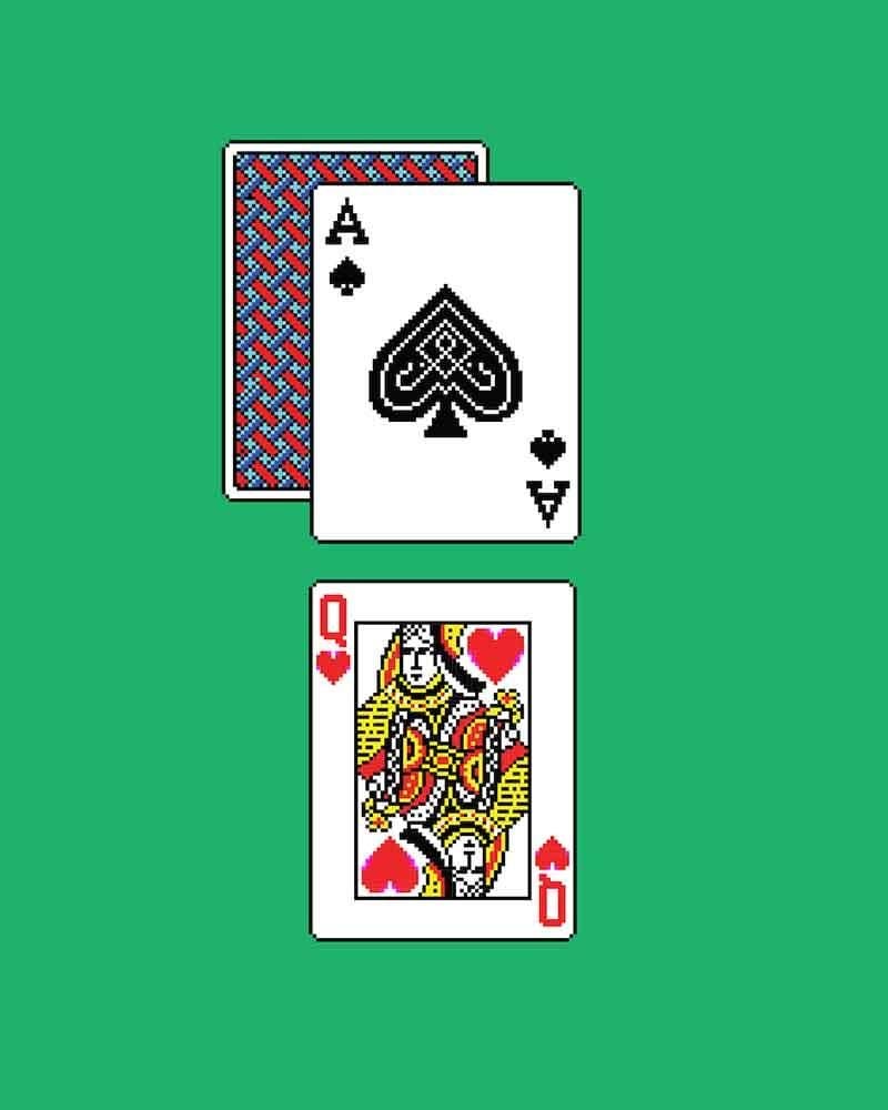
After leaving Apple in 1986, Kare became creative director for Apple cofounder Steve Jobs at the short-lived NeXT, Inc., an influential computer startup that was eventually acquired by Apple. She founded her own eponymous design firm in 1989, which created graphic designs for hundreds of clients, including Autodesk, Facebook, Fossil, General Magic, IBM, Microsoft and PayPal. Some of her more memorable work includes the playing cards for Microsoft’s Windows 3.0 Solitaire game in 1990 and the virtual gift icons she developed for Facebook in 2007.
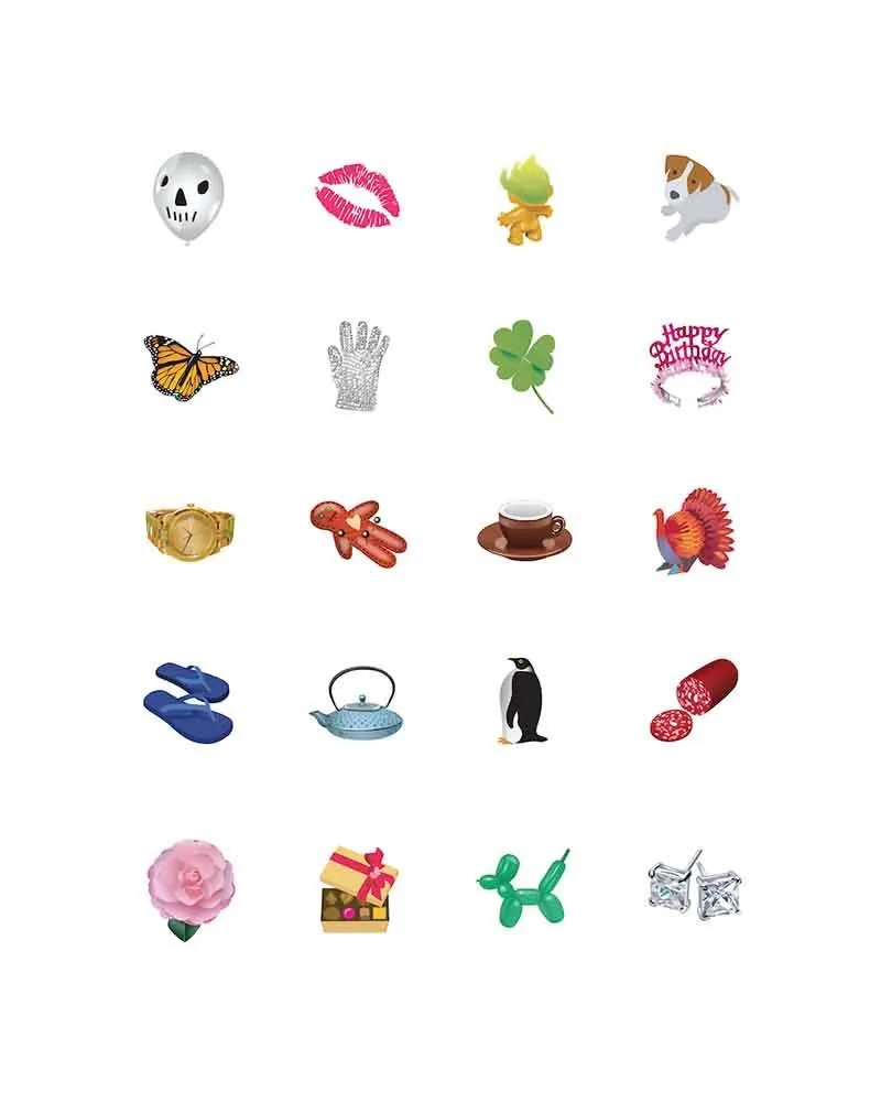
Since 2015, she has served as creative director at Pinterest. Once again, she has used her conceptual brilliance to develop a series of iconic images, some of them based on push pins to symbolize “pinning” items on the website.
Reflecting on her career, Kare is immensely proud of the groundbreaking work she did at Apple. It was an intense time with untold pressure to perform on a new product launch that demanded countless hours of work, rework and work again to get everything right.
She fondly recalled those days in a recent email:
“I loved working on that project—always felt so lucky for the opportunity to be a nontechnical person in a software group. I was awed by being able to collaborate with such creative, capable and dedicated engineers.”
Then in typical graphic-designer style, she added:
“My ‘work/life balance’ has improved since then. : n )”
/https://tf-cmsv2-smithsonianmag-media.s3.amazonaws.com/accounts/headshot/dave.png)