SwiftUI Animations: The Basics of Animations and Transitions
SwiftUI provides several types of animations to create various effects. Here are a few examples demonstrating different types of animations in SwiftUI:
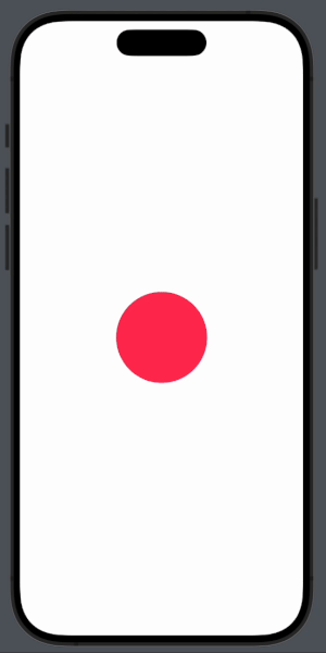
1. Basic Animation with opacity
import SwiftUI

struct OpacityAnimationView: View {
    @State private var isVisible = true

    var body: some View {
        VStack {
            Circle()
                .fill(Color.red)
                .frame(width: 100, height: 100)
                .opacity(isVisible ? 1 : 0)
                .animation(.easeInOut(duration: 1.0), value: isVisible)

            Button("Toggle Opacity") {
                isVisible.toggle()
            }
            .padding()
        }
    }
}
The OpacityAnimationView demonstrates a basic opacity animation in SwiftUI. It uses a state variable isVisible to control the opacity of a red circle. The circle's opacity changes between fully visible (1) and fully transparent (0) based on the value of isVisible. The animation modifier applies an ease-in-out animation over 1 second whenever isVisible changes. A button labeled "Toggle Opacity" toggles the isVisible state, causing the circle to smoothly fade in and out.
2. Rotation Animation
struct RotationAnimationView: View {
    @State private var rotation: Double = 0

    var body: some View {
        VStack {
            Rectangle()
                .fill(Color.green)
                .frame(width: 100, height: 100)
                .rotationEffect(.degrees(rotation))
                .animation(.easeIn(duration: 1.0), value: rotation)

            Button("Rotate") {
                rotation += 45
            }
            .padding()
        }
    }
}
The RotationAnimationView demonstrates a basic rotation animation in SwiftUI. It uses a state variable rotation to control the rotation angle of a green rectangle. The rectangle's rotation changes based on the value of rotation, with each change animated over 1 second using an ease-in curve. A button labeled "Rotate" increments the rotation state by 45 degrees each time it's pressed, causing the rectangle to rotate smoothly.
3. Spring Animation
struct SpringAnimationView: View {
    @State private var scale: CGFloat = 1.0

    var body: some View {
        VStack {
            Circle()
                .fill(Color.blue)
                .frame(width: 100, height: 100)
                .scaleEffect(scale)
                .animation(.spring(response: 0.5, dampingFraction: 0.3, blendDuration: 0), value: scale)

            Button("Spring Animation") {
                scale = scale == 1.0 ? 1.5 : 1.0
            }
            .padding()
        }
    }
}
The SpringAnimationView demonstrates a spring animation in SwiftUI. It uses a state variable scale to control the scale factor of a blue circle. The circle's size changes based on the value of scale, with a spring animation that has a response time of 0.5 seconds and a damping fraction of 0.3, ensuring a bouncy effect. A button labeled "Spring Animation" toggles the scale state between 1.0 and 1.5 each time it's pressed, causing the circle to smoothly expand and contract with a springy motion.
4. Custom Timing Curve Animation
struct TimingCurveAnimationView: View {
    @State private var offset: CGFloat = 0

    var body: some View {
        VStack {
            Circle()
                .fill(Color.orange)
                .frame(width: 100, height: 100)
                .offset(x: offset)
                .animation(Animation.timingCurve(0.2, 0.8, 0.2, 1.0, duration: 2.0), value: offset)

            Button("Move") {
                offset = offset == 0 ? 200 : 0
            }
            .padding()
        }
    }
}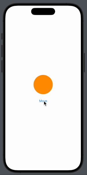
The TimingCurveAnimationView demonstrates a custom timing curve animation in SwiftUI. It uses a state variable offset to control the horizontal position of an orange circle. The circle's position changes based on the value of offset, with a custom timing curve animation defined by control points (0.2, 0.8, 0.2, 1.0) over a duration of 2 seconds. A button labeled "Move" toggles the offset state between 0 and 200, causing the circle to smoothly move left and right with the specified timing curve.
5. Animating Multiple Properties
struct MultiplePropertiesAnimationView: View {
    @State private var change = false

    var body: some View {
        VStack {
            RoundedRectangle(cornerRadius: change ? 50 : 0)
                .fill(change ? Color.purple : Color.yellow)
                .frame(width: change ? 200 : 100, height: change ? 200 : 100)
                .rotationEffect(.degrees(change ? 45 : 0))
                .animation(.easeInOut(duration: 1.0), value: change)

            Button("Animate") {
                change.toggle()
            }
            .padding()
        }
    }
}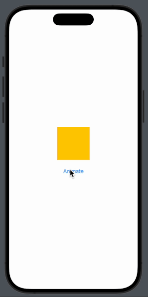
The MultiplePropertiesAnimationView demonstrates animating multiple properties simultaneously in SwiftUI. It uses a state variable change to control various attributes of a rounded rectangle. The rectangle's corner radius, color, size, and rotation change based on the value of change. When change is true, the rectangle has a corner radius of 50, is purple, has a size of 200x200, and is rotated by 45 degrees. When false, the rectangle has a corner radius of 0, is yellow, has a size of 100x100, and is not rotated. A button labeled "Animate" toggles the change state, causing the rectangle to animate smoothly between these states over 1 second using an ease-in-out animation.
6. Repeating Animation
struct RepeatingAnimationView: View {
    @State private var scale: CGFloat = 1.0

    var body: some View {
        Circle()
            .fill(Color.pink)
            .frame(width: 100, height: 100)
            .scaleEffect(scale)
            .onAppear {
                let baseAnimation = Animation.easeInOut(duration: 1.0)
                let repeated = baseAnimation.repeatForever(autoreverses: true)
                withAnimation(repeated) {
                    scale = 1.5
                }
            }
    }
}
The RepeatingAnimationView demonstrates a repeating animation in SwiftUI. It uses a state variable scale to control the scale factor of a pink circle. The circle's size changes based on the value of scale. When the view appears, an animation with ease-in-out timing and a duration of 1 second is defined and set to repeat forever with auto-reversing. Using withAnimation, the scale state is set to 1.5, causing the circle to continuously grow to 1.5 times its size and shrink back to its original size in a smooth, repeating cycle.


![[SwiftUI] Mastering Circular Animations with Gradients](https://miro.medium.com/v2/resize:fit:679/1*tAS-2yHtrK9bE5k_ZnMTPA.jpeg)

